Demolition

Recently, I photographed a couple of demolition sites in Vancouver.  These light industrial and commercial areas are the last of their kind in areas that have already been substantially redeveloped.  Now, they too will make way for condominiums.  Once the new buildings have risen the transformation will be complete.  

Candidates for inclusion in a future revision of the City of Glass portfolio.   

Through the Veil, Vancouver, 2014

Demolition Site, Vancouver, 2014

Making Way, Vancouver, 2014

Exposed, Vancouver, 2014

Frosted Rubble, Vancouver, 2014

Prairie Revisited

The Prairie Modern photographs were made in 2005 and the spring of 2006.  During that period I photographed the prairie intensively and more or less exclusively.  

I also photographed the prairie after this period creating a few more photographs I love.  They are similar in some ways, but have a different look and feel.  

The Prairie Modern photographs adhere to self-imposed constraints reflected in their formal and symmetric compositions.  The later ones break from those constraints.   They are more relaxed and organic and perhaps even a little romantic.   

Here's a few of my favourite post Prairie Modern photographs.

Edges, Alberta, Fall 2006

Above, Alberta, Winter 2006

Clumps and Abandoned Shed, Alberta, 2012

I didn't recognize the end of the Prairie Modern project until sometime after it had happened.  Starting in the summer of 2006 there there were several years of lean photographic activity as I focused on leading product development teams at a startup.  The photographs during this period started heading in new directions.  The prairies remained the same, but I changed. 

I haven't included the more recent photographs in the Prairie Modern portfolio.  The portfolio is not a 'best of' collection of every photograph I've taken of the prairies.  Instead, its meant to be a cohesive set of photographs with its own narrative and a consistent aesthetic.  

There are also some fine photographs of the prairies taken before the project.  They are different from the project photographs and the ones that came later.  I think of them as precursors.  But that's a topic for a future post.  

I thought perhaps the more recent photographs might lead to a new prairie project and maybe they will someday.  But for now they are a vignette rather than a full story.  

Staying True to Myself

In the fall of 2003 I decided I should make more 'commercially viable' photographs so I could sell more prints.  The results were mostly mediocre.  I see it as a period where I failed to be true to myself, but it's a little more nuanced than that.    

It was fall, so I decided to photograph fall colours in the mountain parks - because that was something serious nature photographers did.  Here's a couple of the better ones.     

Kootenay Plains, Fall, 2003

Banff National Park, Fall, 2003

Ironically, looking at these photographs now, I find myself liking them better than I did at the time.  The compositions are simple and striking - especially at 'thumbnail size'.  The fall colours are beautiful.

Let's compare these to a couple of photographs taken earlier in 2003 (January and March).

Aspens Hanging, Elk Island National Park, 2003 (from Elk Island)

Aspens Hanging, Elk Island National Park, 2003 (from Elk Island)

Trees in Spring Snow, Elk Island National Park, 2003 (from Elk Island)

Trees in Spring Snow, Elk Island National Park, 2003 (from Elk Island)

They are all photographs of aspens and they all have structured compositions.  In the fall photographs everything falls on the same plane, while the winter photographs have depth.  Partly, this is because the fall photographs were made with a telephoto lens and the winter ones with a wide angle lens.  In the fall, I was deliberately choosing to use telephoto lenses because I felt this was something 'serious' photographers did.  I wanted to become skilled at making intimate landscapes.

But there's more to it than just lens choice.  The fall photographs are very much about the thing being photographed.  They are more portrait than landscape.  But unlike a good portrait they seem to lack emotional engagement.  Indeed, they were photographed at the side of the road while I was driving along 'seeking' compositions.

By comparison, the winter photographs are as much about the space as the things in them.  I am literally immersed.  I'm wandering on foot well away from the road and responding to my environment rather than mechanically seeking compositions. 

Both of the winter photographs were taken in Elk Island National Park, in an area I visited many times.  It's off the beaten path.  A special place place I had to myself.  I think my strong emotional attachment comes through in the photographs.

Its not that the choices made in the fall photographs are inherently wrong or poorer.  They just reflect choices that are less true to me.  I prefer photographs containing objects in multiple planes parallel to the viewer over photographs where the subject matter is primarily in a single plane.  Similarly, I prefer the quiet solitude of winter to the vibrant colour of fall.  Winter's snow covered landscapes with stark branches devoid of leaves have a simplicity and elegance that reminds me of calligraphy.

The first four months of 2004 read like a searching process with plenty of experimentation.  I'm reminded there's a delicate balance between being true to yourself and becoming set in your ways.  In my mind I remember the period from fall of 2003 to the spring of 2004 as wandering around in a photographic desert brought on by overthinking the process.  But looking back, I see it wasn't that simple.  In part, I was trying different things, which informed future experiences even if they weren't entirely successful on their own.  It was also a reflection of my limitations.  Although I didn't realize it at the time, I had many things to learn about seeing the world.  So, it was probably also a necessary part of the learning process.  And finally, there's luck.  There are stretches where I seem to see photographs everywhere and others that are simply less productive. 

I've been more sure of my photographic sense of self since then, but it's not a static thing - it keeps evolving and changing.  There are times when I'm searching.  But now I'm more likely to let it come to me rather than trying to make other people's photographs.

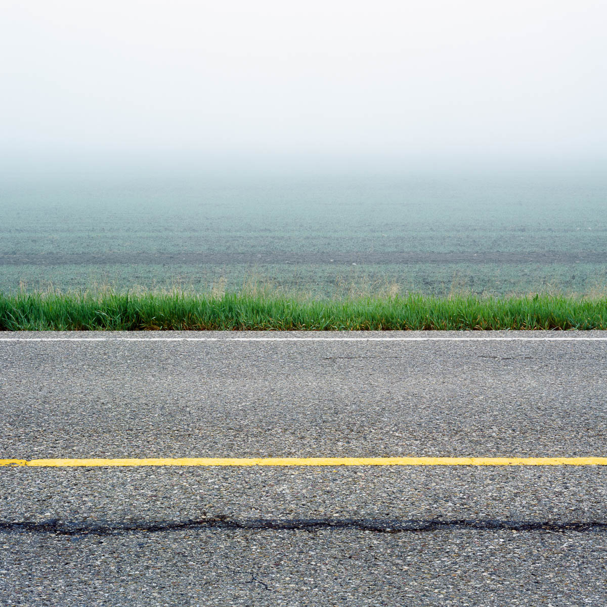
Eventually, in late spring of 2004, the wandering ended with the start of what would become an intense explosion of activity resulting in the Prairie Waters series of photographs.

At the Edge, Cooking Lake, May 29, 2004An explosion of forms leading to the Prairie Waters explosion.

At the Edge, Cooking Lake, May 29, 2004
An explosion of forms leading to the Prairie Waters explosion.

Website Design Choices and Squarespace

I had strong opinions on how I wanted ericfredine.ca to present my photographs:

  • Generous whitespace and no clutter:  I wanted the website to reflect the aesthetic of the photographs: precise and concise.  A lot of content is festooned with sharing icons and other 'calls to action'.  I decided to eschew those adornments.
  • Respect the images:  I didn't want text overlays on the images and I always want the images presented in their native aspect ratio. 
  • Large images for thumbnail views:  Most people are only going to spend a few minutes so I want to immediately share a beautifully presented overview of images large enough to be appreciated.  If they like what they see, there are plenty of options to explore further.
  • Columns for thumbnails:  Most of my photographs have a square or vertical aspect ratio.  A column oriented presentation makes these images appear larger at the expense of having images with a horizontal aspect ratio appear relatively smaller.  The (more common) presentation of images in rows makes horizontal images appear larger at the expense of vertical aspect ratios.  So, for me, a column oriented presentation makes the most sense.
  • Fit columns to the display:  Big screens should have more columns, and small screens fewer columns.
  • Size images for the display:  If you have a bigger display you should see a bigger image.  If you have a smaller display you should still be able to see the entire image. 
  • Adapt the experience for mobile devices:  Smaller devices (such as smartphones) require a simpler user experience that vertically scrolls images.
  • No modes:  Many photography websites use features like light-boxes that have to be dismissed.  I prefer a website that is not modal.
  • Easy navigation and fast, smooth transitions between images:  The focus should be on the images rather than the mechanics of viewing them.
Cracked, Alberta, 2005 from Prairie Modern

Cracked, Alberta, 2005 from Prairie Modern

I also decided to go with a white background.  This is a trade-off.  I think images look better on a dark background.  However, a white background feels more elegant.  I also feel like the transition to a white web page is often less abrupt because the majority of websites have a white background.

I chose Squarespace to implement my website.  They have many different templates that are all beautifully designed.  I used the Wells template because it - somewhat remarkably to me - met all of my design criteria.  For a while I considered building my own website and did some exploratory work as a learning exercise.  This helped me to fully appreciate the simple elegance of the design choices in the Wells template!  

The template is easy to customize in a variety of ways and I took advantage of the custom css feature to tweak a few things.  There's enough room to make your own choices, so I wouldn't expect another website using the Wells template to look exactly like mine.  And besides, mine is likely to look like mine because of the photographs which are front and centre as they should be.  

So far - its still early of course - I'm very happy with the Squarespace experience and would recommend it to others.  The tools for creating and managing content are comprehensive and generally easy to use.  In the beginning it can be a bit overwhelming and difficult to figure out how to do things and how the different features are organized.  But that tends to be true of all functionally rich products.  Fortunately, it's easy and productive to do a Google search for questions which usually lead to definitive Squarespace documentation or a relevant posting on Squarespace forums.

On Publishing a Website

The hard part about publishing a photography website is not the mechanics of the website - though that is not without its frustrations.  Fortunately, the tools have improved dramatically in the last few years.  No, the hard part is organizing and selecting the images.  The hardest part is being honest about which ones are most elegant and meaningful.  

Photographers usually aren't the best curators of their own work.  We get attached to images for personal reasons that may not be effectively reflected in the images.  I've tried to adhere to the mantra of "if in doubt leave it out".  Having said that, I'm sure over time there will be additions and deletions to the portfolios as certain images fall in and out of favour with me.  And I'll write some blog posts about images that missed the cut and when I make changes I'll blog about that too.

Some portfolios are ongoing: City of Glass, Tidal Waters and Mountain Waters.    

As for the design of the website, I've tried to make it consistent with the aesthetic of the images.

I hope you enjoy it.  Feel free to share feedback on the Contact page or leave a comment below.