I had strong opinions on how I wanted ericfredine.ca to present my photographs:
- Generous whitespace and no clutter: I wanted the website to reflect the aesthetic of the photographs: precise and concise. A lot of content is festooned with sharing icons and other 'calls to action'. I decided to eschew those adornments.
- Respect the images: I didn't want text overlays on the images and I always want the images presented in their native aspect ratio.
- Large images for thumbnail views: Most people are only going to spend a few minutes so I want to immediately share a beautifully presented overview of images large enough to be appreciated. If they like what they see, there are plenty of options to explore further.
- Columns for thumbnails: Most of my photographs have a square or vertical aspect ratio. A column oriented presentation makes these images appear larger at the expense of having images with a horizontal aspect ratio appear relatively smaller. The (more common) presentation of images in rows makes horizontal images appear larger at the expense of vertical aspect ratios. So, for me, a column oriented presentation makes the most sense.
- Fit columns to the display: Big screens should have more columns, and small screens fewer columns.
- Size images for the display: If you have a bigger display you should see a bigger image. If you have a smaller display you should still be able to see the entire image.
- Adapt the experience for mobile devices: Smaller devices (such as smartphones) require a simpler user experience that vertically scrolls images.
- No modes: Many photography websites use features like light-boxes that have to be dismissed. I prefer a website that is not modal.
- Easy navigation and fast, smooth transitions between images: The focus should be on the images rather than the mechanics of viewing them.
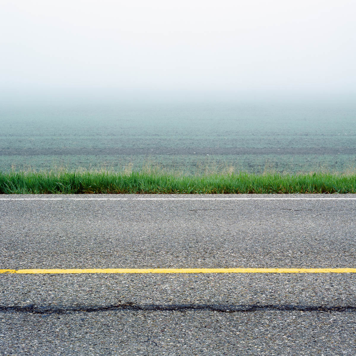
Cracked, Alberta, 2005 from Prairie Modern
I also decided to go with a white background. This is a trade-off. I think images look better on a dark background. However, a white background feels more elegant. I also feel like the transition to a white web page is often less abrupt because the majority of websites have a white background.
I chose Squarespace to implement my website. They have many different templates that are all beautifully designed. I used the Wells template because it - somewhat remarkably to me - met all of my design criteria. For a while I considered building my own website and did some exploratory work as a learning exercise. This helped me to fully appreciate the simple elegance of the design choices in the Wells template!
The template is easy to customize in a variety of ways and I took advantage of the custom css feature to tweak a few things. There's enough room to make your own choices, so I wouldn't expect another website using the Wells template to look exactly like mine. And besides, mine is likely to look like mine because of the photographs which are front and centre as they should be.
So far - its still early of course - I'm very happy with the Squarespace experience and would recommend it to others. The tools for creating and managing content are comprehensive and generally easy to use. In the beginning it can be a bit overwhelming and difficult to figure out how to do things and how the different features are organized. But that tends to be true of all functionally rich products. Fortunately, it's easy and productive to do a Google search for questions which usually lead to definitive Squarespace documentation or a relevant posting on Squarespace forums.